In Learning Activity 1.1, we discussed what media arts is. We examined the idea that other disciplines of art contribute to media arts. In this learning activity, we are focusing specifically on visual arts. Let’s get started!
The elements of art and principles of design are the foundations for visual arts. They are the building blocks for art-making. The elements of art and principles of design are also a common language that can be used to discuss art and art-making. You will use self-reflection in this learning activity to help you apply the tools used in analyzing art.
Before we start, let’s try it out!
Based on what we learned in Learning Activity 1.1, you should consider the most dominant principle -- in other words, the principle that has the most impact on the work. It is okay if we do not all share the same answer. Instead, consider why other students might select a different answer than you. What might they be considering differently?
Try it!
Examine the following artwork called The Gates by Christo and attempt the corresponding question.
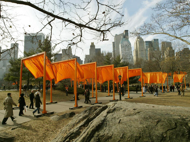
Which principle of media arts do you think is the most dominant in the artwork The Gates by Christo? Select from the following options.

Elements of art
We are going to explore the elements of art as they appear in visual arts. You may wish to make notes for yourself as you will be asked at other times in the course to apply these terms and reflect on how you use them in your own work.
Definition
Press the following tabs to know more.
The continuous mark made on some surface by a moving point. It may be two-dimensional, like a pencil mark on a paper, or it may be three-dimensional (wire), or implied (the edge of a shape or form) often it is an outline, contour, or silhouette. It might be straight, diagonal, zigzag, wavy, thick, thin, etc.
A shape always has two dimensions, length as well as width. This is represented as an enclosed area that is defined by colour, value, space, texture, and form. When lines connect, they form shapes.
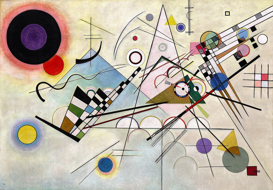
Painting entitled Composition 8 created by Wassily Kandinsky in 1923.
Let’s explore! Observe the painting beside the paragraph by Wassily Kandinsky entitled Composition 8, created in 1923. Kandisnsky was a 20th century Russian abstract painter whose work was often inspired by music. In the artwork, Kandinsky uses a variety of different lines. Notice the strong, straight diagonal lines. There are also repeating curved lines, and a bold, wavy line. When the lines intersect, they create shapes such as squares, rectangles, circles, and triangles.
Definition
Press the following tabs to know more.
A form has three dimensions: length, width, and height. For example, cubes, pyramids, spheres, or even cylinders. Therefore, form has depth as well as height. Sculptures and decorative arts serve as good examples for form. It might also be the dimension an artist creates by increasing the value range, such as in a portrait illustration, which is shaded.
Space is the creation of visual perspective; this gives the illusion of depth. Space can also mean the way an artist uses the area within the picture plane. Real space is actually three-dimensional. The way an artist uses the combination of positive and negative space can have a great effect on the entire composition.
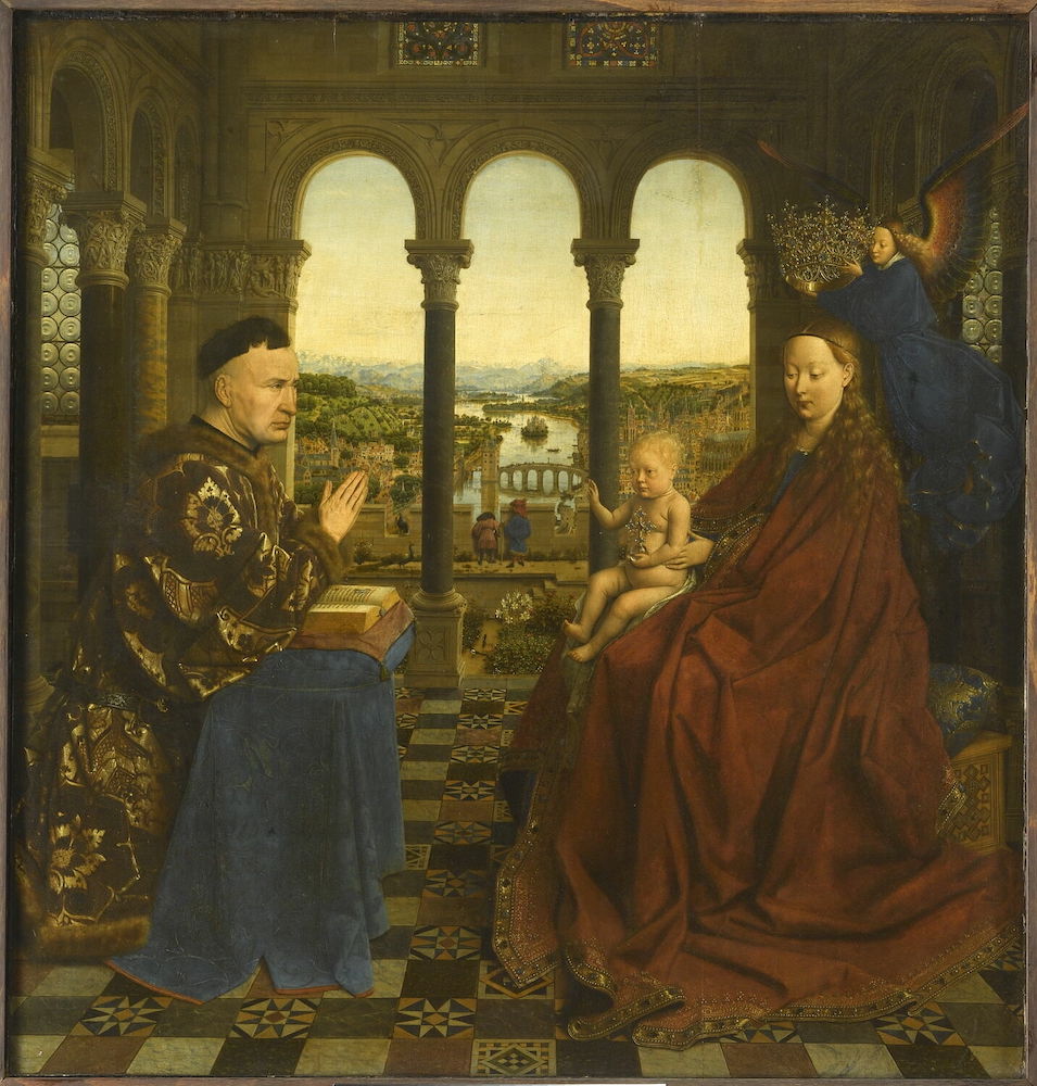
The artwork entitled The Virgin of Chancellor Rolin was painted by Jan van Eyck in c. 1430-35.
Let’s examine! The artwork beside the paragraph is by Belgian painter Jan van Eyck, entitled The Virgin of Chancellor Rolin, and was painted c. 1430-35. The image shows space by the way the artist has created depth. Nearest to the viewer, the figures are large and have a lot of detail. The floor has leading lines going to the vanishing point. Outside the window, the landscape gets smaller, less detailed, and bluer. This creates the sense of depth and distance. In the artwork, the figures have weight and are shaded with highlights and lowlights to show they are three-dimensional. The woman’s face, for example, has a sense of roundness created by a range of value. This can also be observed in other spaces, such as the columns, which are cylinders, and have a clear highlight.
Try it!
Examine the following artwork called Composition with Red Blue and Yellow by Piet Mondrian and attempt the corresponding question.
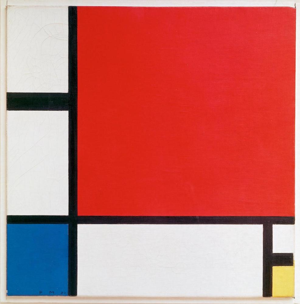
Which is the most dominant element working in Mondrian's Composition with Red Blue and Yellow? Select from the following options.
Definition
Press the following tabs to know more.
Colour has three characteristics, which are hue, value, and intensity. Hue means the shades (red, yellow, or pink). Intensity refers to the brightness or dullness of the work of art.
Texture refers to the surface quality or ‘feel’ of an object, such as roughness, smoothness, or softness. Actual texture can be felt, while simulated textures are implied by the way the artist renders areas of the picture.
Value concerns the lightness or darkness of a colour. Tinting lightens the value of the colour, while shading darkens it. Value can also exist where there is no colour, as in a black and white work that uses a range of tonal values. There is another category called tones that is created by mixing a pure colour with both black and white.
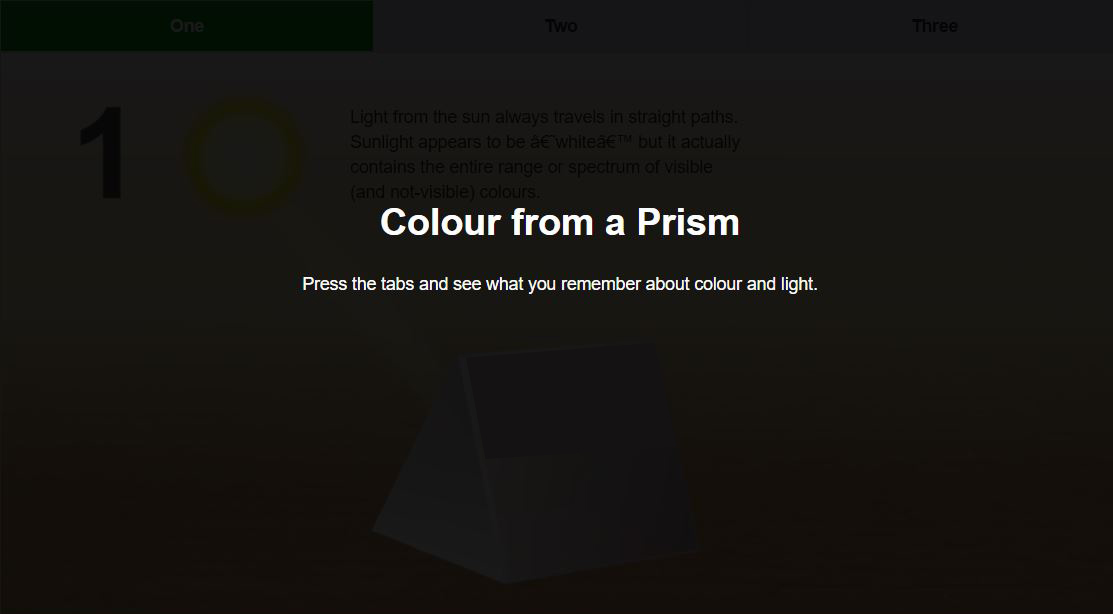
Check out the following interactive entitled Colour from a Prism to learn more about colour.
Press the Start button to access the following interactive. This interactive will open in a new window.
Press here for an accessible version of Colour from a Prism. (Opens in new window)
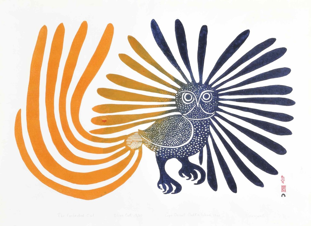
A print called The Enchanted Owl by Kenojuak Ashevak.
Let’s examine! Beside the paragraph is a print by Inuit artist Kenojuak Ashevak called The Enchanted Owl. The print uses a dull red-orange hue which gradually becomes darker in its value until it becomes black. This is called a gradient. The shape of the feathers communicates a smooth texture. This is in contrast to the short lines on the body of the owl, which creates a fluffier texture and implies the direction of the feathers.
Try it!
Examine the following artwork called Mt. Lefroy by Canadian painter Lawren Harris and answer the corresponding question.
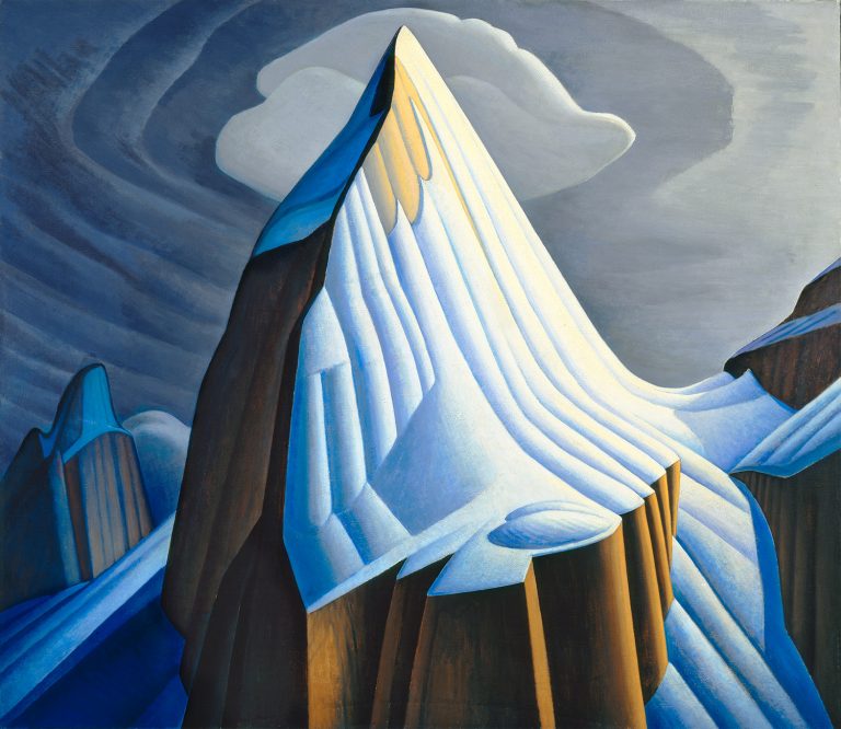
Which is the most dominant element working in the artwork, Mt. Lefroy, by Lawren Harris? Select from the following options.
Principles of design
The principles of design describe the ways that artists use the elements of art in a work of art. Like the elements of art, they provide rules or guidance on how artists can create effective artworks both aesthetically and conceptually. The concept is the message or theme the artists is exploring or challenging the viewer to explore. When we have a common language, it helps to have critical conversations about art, and ensures we can give and receive feedback in a way that is criteria based and understandable.
Definition
Press the following tabs to know more.
Balance is a sense of stability in the body of work. Balance can be created by repeating same shapes and by creating a feeling of equal weight. There are different types of balance: symmetrical, asymmetrical, and radial. Symmetrical is where both sides have the same weight. Imagine a butterfly. Asymmetrical balance uses different sized objects on each half of the composition. Imagine an old tree. The third type of balance is radial, where the subject spirals out from the center. Imagine a seashell.

Emphasis in a composition refers to developing points of interest to pull the viewer’s attention to important parts of the body of the work.
Harmony is achieved in a body of work by using similar elements throughout the work. Harmony gives an uncomplicated look to your work.
Movement adds excitement to your work by showing action and directing the viewer’s attention throughout the picture plane.
Let’s apply what we’ve learned! Following is an artwork by Georges Seurat called A Sunday on La Grande Jatte . In the artwork, the artist has used asymmetrical balance. There is more weight on the right side of the work where the largest subjects are. This is balanced by the large amount of smaller subjects in open space (one of our elements). Placing the two largest figures so far to the right gives the impression that the couple are entering the composition. Emphasis is created by the artist’s use of pointillism, a technique in which an image is created exclusively using tiny coloured dots. While it is a sunny day at the park, the shade from trees and umbrellas darken most of the figures’ value (another element), which also draws attention. Lastly, harmony is achieved by the artist’s choice of colour (another element), particularly in the shades of green to differentiate sunlit and shaded grass and leaves.
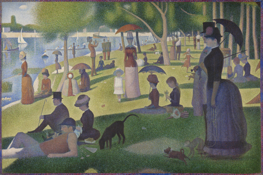
A Sunday on La Grande Jatte by Georges Seurat.
Try it!
Examine the following artwork, Quince, Cabbage, Melon, and Cucumber by Juan Sánchez Cotán, and answer the corresponding question.
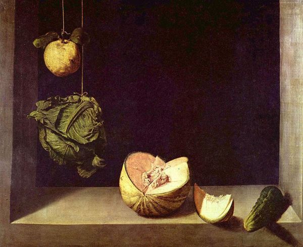
Which is the most dominant element working in Quince, Cabbage, Melon, and Cucumber? Select from the following options.
Definition
Press the following tabs to know more.
Proportion, also called scale, refers to the relationships of the size of objects in a body of work. Proportion gives a sense of size seen as a relationship of objects, such as smallness or largeness.
Repetition is the repeating a single element many times in the artwork.
Rhythm is a type of movement in drawing and painting. It is seen in repeating of shapes and colours. Alternating lights and darks also give a sense of rhythm.
Unity is seen in a painting or drawing when all the parts equal a whole. Your work should not appear disjointed or confusing.
Variety refers to the differences in the work. You can achieve variety by using difference shapes, textures, colours, and values in your work.
Let’s revisit Quince, Cabbage, Melon, and Cucumber by Juan Sánchez Cotán. Cotán was a Spanish painter who created realistic still-life paintings of everyday objects. Quince, Cabbage, Melon, and Cucumber plays with proportion by changing the height of different subjects in nature. The placement of the vegetation — plus dark background — all create a line that draws attention from one to the other. The effect is a unified composition where all parts seem to belong and are in relationship to each other. Despite the unity, he still uses variety by choosing different types of vegetables and varying the colours, sizes, and orientation.
Sketchbook
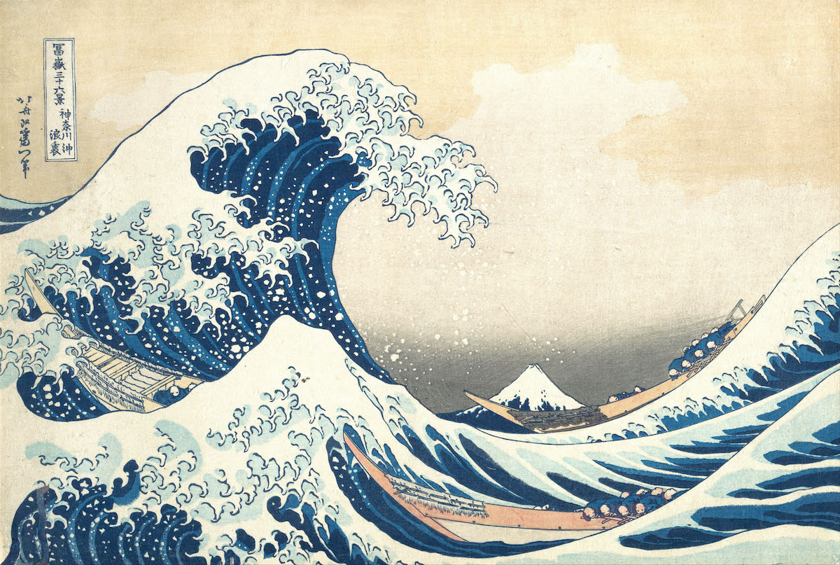
Flip it! You have explored several examples of how an artwork can be deconstructed by examining the elements of art and principles of design. Now, you try it! In your sketchbook or other document, write a deconstruction of how the elements of art and principles of design are used in the artwork beside the paragraph called The Great Wave off Kanagawa by Japanese artist Katsushika Hokusai.
You don’t need to describe them all! Start with the most dominant images. Brainstorm a list based on your initial reaction. Jot it down. Then write out a short paragraph, like the ones in the preceding section. Share it with a classmate, a family member, or someone you feel comfortable with. Also keep in mind that you need to show them the artwork!
Portfolio
Throughout this course, you will be asked to contribute items to your portfolio. A portfolio is a way to show your growth and learning over time. For this course, the portfolio will be built throughout each unit. In the final unit, you will submit all your portfolio entries and tasks. You are encouraged to submit your work as you go, as the portfolio can keep all your work in one place.
To create the portfolio, it is recommended that you create a digital folder and title it “Media Arts Portfolio”. Place all the files you create when you find a portfolio task into this folder. Change the file name to the name of the task. The following success criteria for this task can also be used as a self-assessment tool to consider if your work is demonstrating the learning goal.
Success criteria for all portfolio tasks
Portfolio task: Design workbook
Press the following tabs to know more about the task.
Creative challenge: Design an infographic or poster that illustrates the elements of art. Use design choices to help communicate the definition of each element.
Target audience: Grade 7 and 8 visual arts students.
Media: Student’s choice (example, digital, pen and ink, pencil crayon, marker, paint).
Keep in mind that all images must be your own. Include one or more page(s) of process work and one file to show the finished infographic.
Creative challenge: Create a textbook page or spread to identify the principles of media arts in artworks.
Target audience: Grade 9 visual arts student.
Media: Student’s choice (example, digital, pen and ink, pencil crayon, marker, paint).
Keep in mind that you need to include artworks, artwork credit (artist, title, medium, date), and a sentence to explain how principles of design are being demonstrated. Do not repeat from artworks shared in this learning activity. Consider the overall design and look of the “textbook” page.

Conclusion
This learning activity focused on the discipline of visual arts. We developed an understanding of the building blocks that help visual artists to communicate their ideas, messages, and concepts. You will be using these terms often throughout the course. Consider what notes or reflections you might want to keep for yourself. In Learning Activity 1.3, we are going to explore composition in more depth.